One of the unexpected consequences of attending college in Connecticut has been experiencing autumn twice a year. I watch the trees of New Haven1 change color during late October and early November, then return home in Georgia for fall break and watch the leaves change color again.
I understood the basic principle behind my double-dipping of fall. In late October, Connecticut is colder and receives less daylight hours than my home in Georgia, triggering trees stop making green chlorophyll and allowing the yellows, oranges, and reds of the other pigments (like xanthophylls, carotenoids, and anthocyanins) to become visible earlier. However, I began to wonder when autumn came to other parts of North America, and the rate that it moved. I have seen fall color forecasts. But what would it look like actually to observe leaf color change across the whole continent? I decided to tackle this question over my winter break.
Having been a contributor for several years now, I turned to iNatrualist for answers. For the uninitiated, iNaturalist is a website where users can submit and identify observations of any taxa of life: a social media for naturalists in a sense. I had three qualifications choosing a tree species. It had to have a drastic fall color change, a large range, and many observations. After considering Sugar Maple, (Acer saccharum), Sassafras (Sassafras albidum), Trembling Aspen (Populus tremuloides), among other trees, I finally decided on Red Maple (Acer rubrum), which had the highest observation count.
Results
Process
I painstakingly looked through the images of all 10,000+ observations and wrote down each the color of the leaves in each observation.
Just kidding.
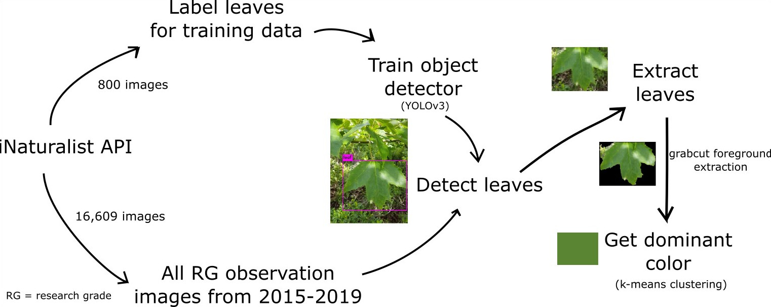
Leaf Detection
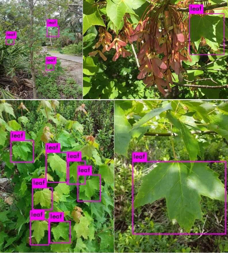
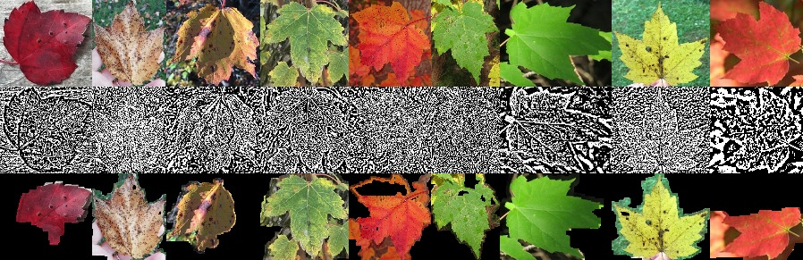
An observation’s images could contain branches, buds, bark, roots, seeds, and any number of other features to help with identification. So, I knew I had to detect if there was a leaf in in the image, and where the leaf was in the image. In other words, I was dealing with object detection. I chose a deep learning approach, You Look Only Once (YOLO), for object detection because of its speed and good documentation.
Using the iNatrualist API, I downloaded the images from every 10th page of research grade A. rubrum observations. I created a training set by labeling the leaves in 800 images using LabelImg and trained the model for 3500 batches (around 16 hours on my computer). In hindsight, I could have had even better accuracy if I had created additional classes for other features like branches and seeds, but overall, I am pleased with the performance of the model. There are several instances where it identified very small leaves, getting more sky than leaf, resulting several blue to white dominant color however. See the object detector on Github.
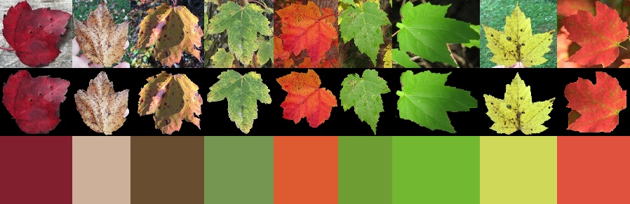
Leaf Color
Once I knew where the leaf was, I expected getting the leaf color to be easy, but it required more experimentation than I expected. At first, I tried to get the color of the leaf without doing any additional manipulation to the leaf sub-image. I used k-means clustering to get the dominant color of the image. I was surprised by how well k = 3 performed, but I thought I could get an even better color if I extracted the foreground.
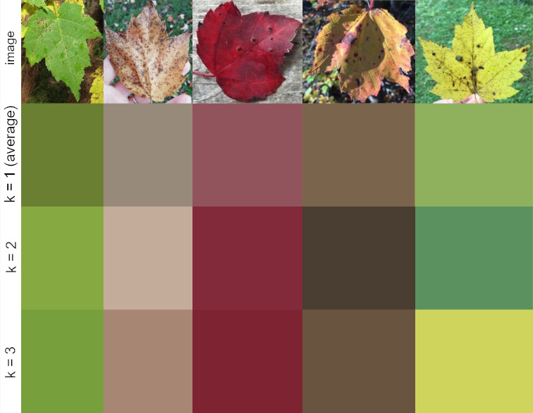
I tried a variety of methods, including creating masks from the largest contour provided by canny edge detection and adaptive thresholding, but with limited success. Eventually I stumbled upon the grabcut algorithm, which performed miles better than anything I had come up with.
Grabcut worked well for leaves with defined edges, but for leaves with less defined leaf edges, sometimes it would cut out the entire foreground, which in case I would get the dominant color of the entire leaf sub-image. When an observation had multiple leaves, I got the dominant color (k = 2) of the dominant colors of each of the leaves. If I were to do it over, I would have combined the extracted leaf foregrounds into the same array, and taken the dominant color of that.
Once I got the main image processing pipeline set up, I ran it on the images with leaves in them for all the observations of A. rubrum between 2015-2019. See it on Github.
Creating the Graphics
I initially created a map using leaflet.js but animating the markers was not smooth enough for my liking. Instead, for every day in each year I generated an SVG image. These images were combined into a gif, using Imagemagick, and then converted into a mp4 using ffmpeg. For a future project, I would like to try something with CSS sprite sheet animation, d3.js, or maybe even three.js, but for a long animation like this one, I think the gif was appropriate and is very sharable.
Concluding Thoughts
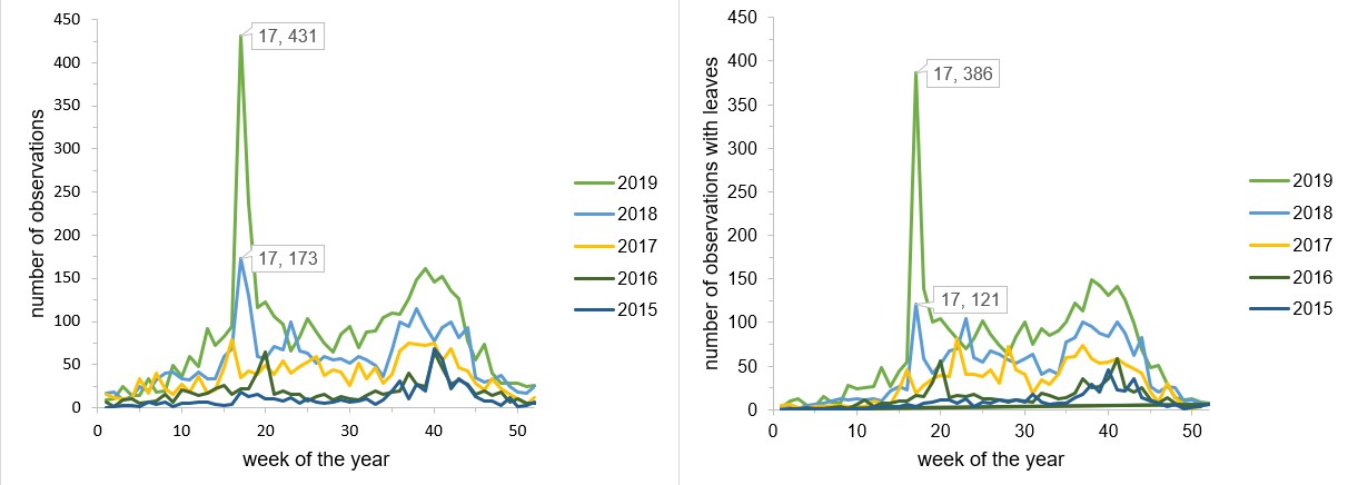
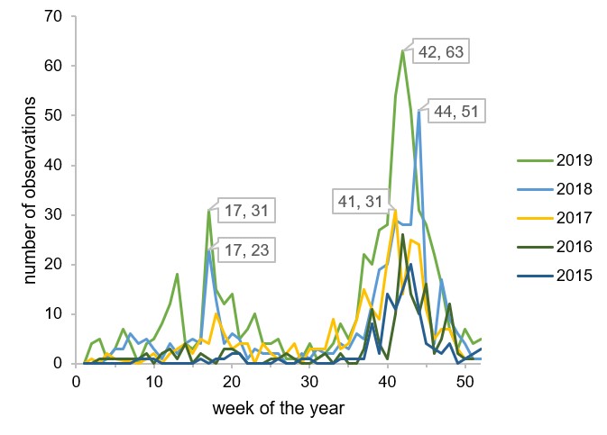
I found it fascinating to see leaf colors change across eastern North America. Observations are increasing every year so this type of visualization will only get better, although certainly they will be skewed towards certain geographic areas and time periods. Users tend to submit observations when they notice something different, so data mostly comes from periods of transitions. I was happy to see that the late timing of fall colors of 2018 was reflected in figure 5.